Visual redesigns are a common part of maintaining a brand identity. Some companies may go all-in and reinvent themselves with a new look. Others may decide that subtlety is key and make a minor change that you may miss at first glance. Here are three brands that went with the subtle approach for their redesigns.
Google’s Capitalizing on Gradiance
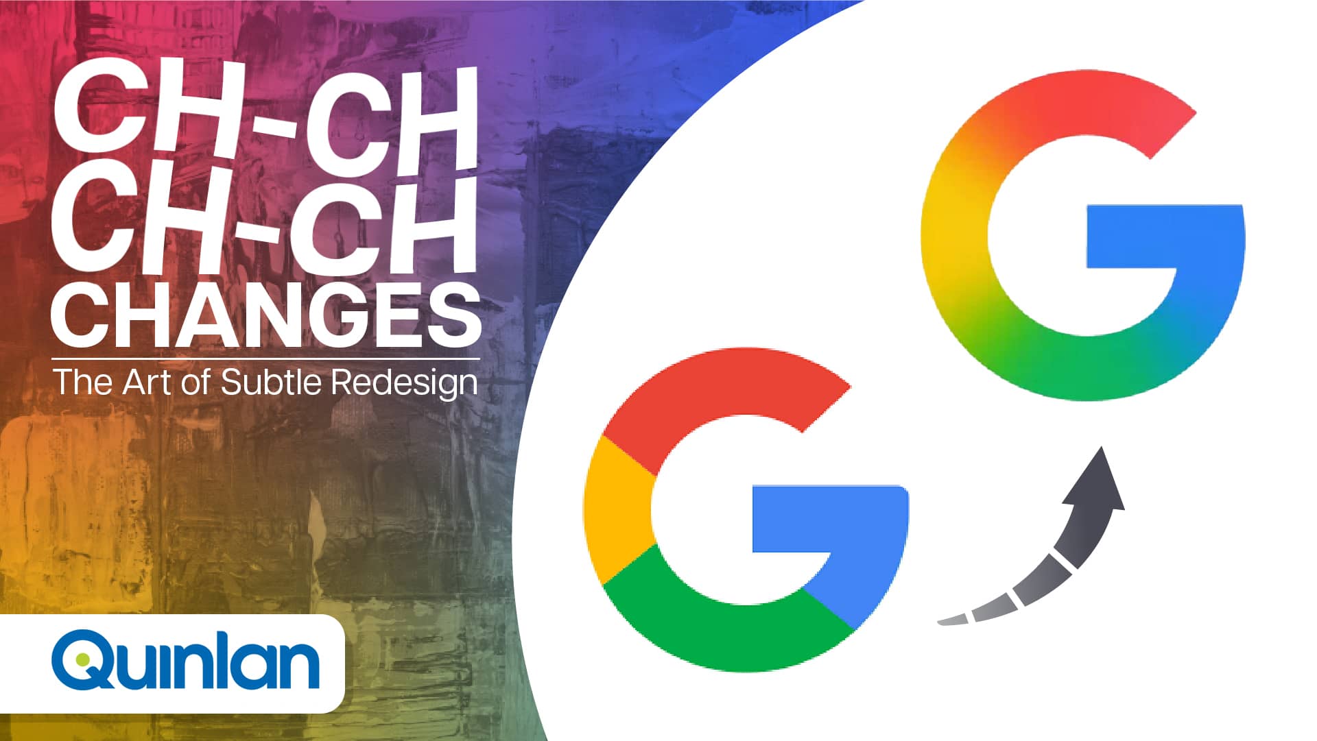
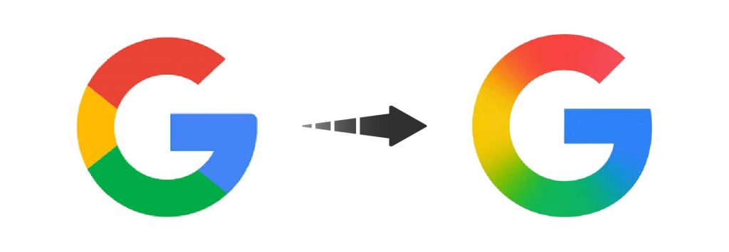
It’s been almost ten years since Google permanently changed an aspect of its visual identity, with their last major rework in 2015 introducing a new logo based on a self-created typeface. In addition, they updated their “G” favicon to match. While their typeface-based logo still remains, in 2025, Google slightly updated its favicon.

Comparing the two at a glance, you might not notice anything. Take a deeper look and you’ll see what’s new: the gradient. Instead of the four colors being segmented with hard lines, the colors now bleed into each other, creating a smoother image. This update introduces visual consistency with the logo for their in-house artificial intelligence model, Gemini. For now, it’s up to speculation as to whether this small update is teasing a larger rebrand.
Deep Blues for Walmart
In early 2025, for the first time in almost 20 years, Walmart updated its wordmark and logo.
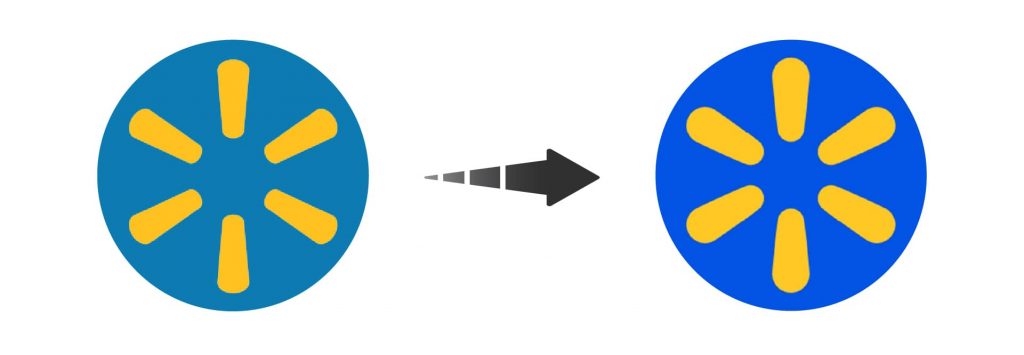
If you were familiar with the brand’s previous look and saw the new designs, you may not know anything has changed. And really, the core design hasn’t. Take a closer look, though, and you can start to see the differences.


Along with introducing a new, thicker font, the brand now has deeper, brighter blues and yellows in its logo. The changes are extremely subtle, but give the brand a refreshed, modern sense of identity that resists straying far from their well-established look. It’s a new, tasteful look without resorting to reinvention, blending familiarity and newness.
Change in the Amazon
Amazon, like Walmart, also made a subtle change to its logo after over 20 years. In addition to changing its main logo, Amazon also updated its brand system for its services like Prime Video and Alexa to ensure consistency between them. While the updates to their services can be noticeable upon first glance, their new logo may require a double-take.

You may notice the new color applied to the arrow. Amazon is a company with a hidden image in the logo – the arrow connecting the ‘a’ to ‘z’ forms a smile – and this new shade gives it a warmer feel. There are also subtle changes in the letters, such as the curved bowls of the ‘a’s changed to be straighter and the ‘m’ appearing thicker. Like the other brands discussed above, it’s a new look that relies heavily on its previous design as the foundation for a fresh new look.
Allow Us to (Re)Introduce You
If your company is contemplating a rebrand or refresh – big or small – get in contact with us today!