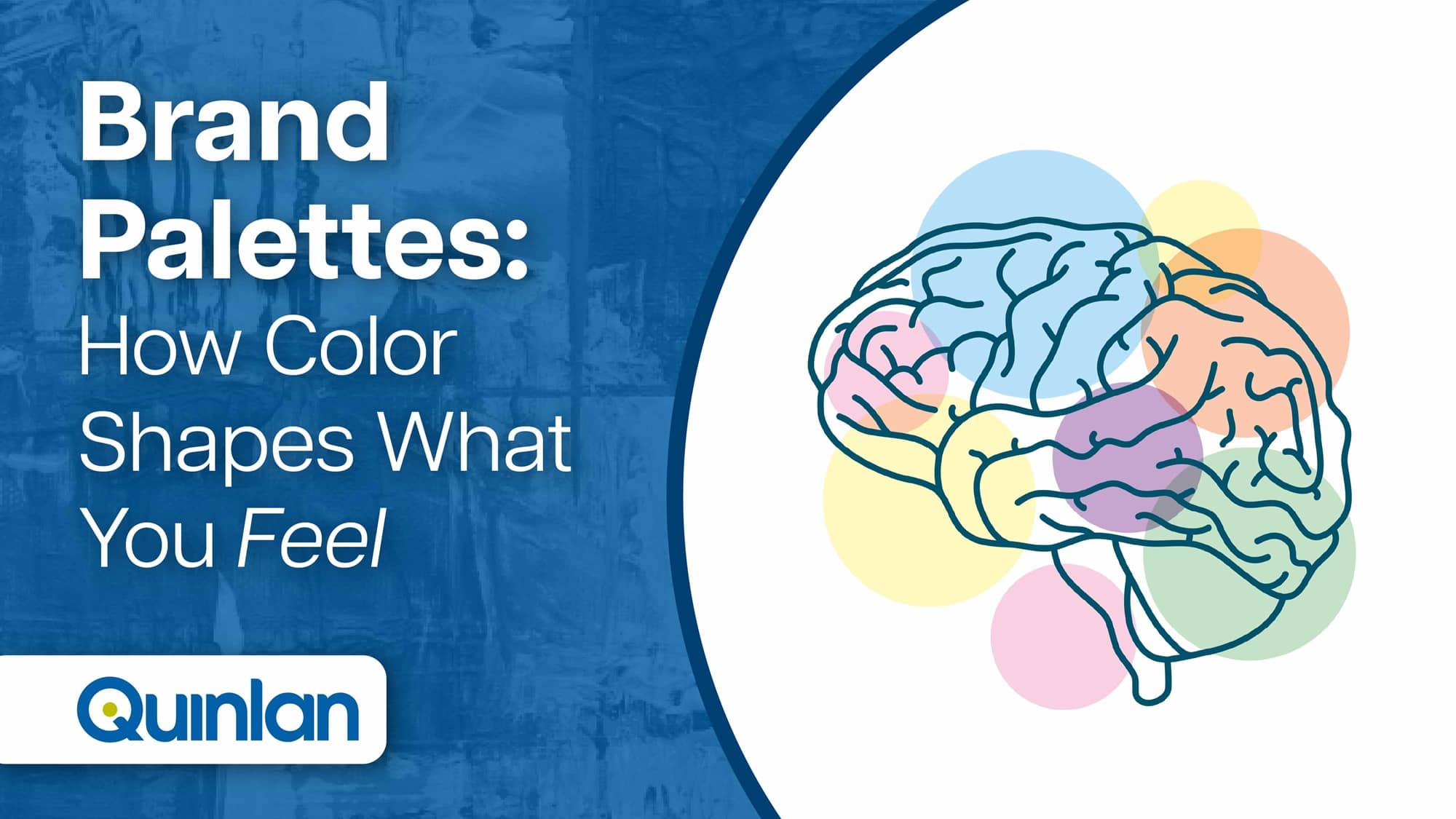
What’s your favorite color? There’s a reason for your choice, just like how brands and companies choose the colors they use. Color can be a brand’s secret weapon, since they increase brand awareness by 80% compared to monochrome and can influence up to 90% of an initial impression. Let’s analyze each primary and secondary color, the emotions and feelings they bring out, and which companies use them.
Primary Colors
The primary colors of red, blue, and yellow cannot be created by combining other colors together. These three are considered the foundations of other colors and are used by a range of brands in a variety of industries like food, television, and broadcasting.
Red
- Emotions and feelings: Energetic, bold, appetite-stimulating, movement, excitement, urgency.
- Used by: Chick-fil-A, Coca-Cola, Kellogg’s, CNN, YouTube, Netflix.
Food and beverage industry icons Chick-fil-A, Coca-Cola, and Kellogg’s love using red because it energizes people and increases blood flow and heart rate. Red causes the digestive system to trigger its metabolism and stimulate appetite. Red also elicits urgency and excitement, perfect to use in the logos for CNN, YouTube, and Netflix since content on those channels is frequently “breaking” or “new.”
Blue
- Emotions and feelings: Trustworthiness, dependability, security, strength.
- Used by: General Electric, Lowe’s, and Oral-B, HP, AT&T, and Dell.
The most popular color in the United States, blue is used by General Electric, Lowe’s, and Oral-B to symbolize the durability and functionality of their products. After all, we want long-lasting washers and dryers, house supplies, and toothbrushes, and we need to trust these products enough to have them in our homes. Brands HP, AT&T, and Dell make items for professional settings like the office, knowing you or your company depend on their products to get work done effectively.
Yellow
- Emotions and feelings: Positivity, youth, happiness, optimism.
- Used by: McDonald’s, Lay’s, Reese’s, and Ferrari.
You may have strong memories in childhood of eating Reese’s peanut butter cups or Lay’s chips, or going through the McDonald’s drive-thru. The commonality between all of them is the yellow in their branding. Seeing it as adults, the color works with psychology to make us even more nostalgic for those items and brands and how they made us feel as kids. Yellow also stimulates alertness, making sense why Ferrari uses it for their logo since they create eye-catching sports cars for the road.
Secondary Colors
The secondary colors of green, purple, and orange are made by combining two primary colors. Despite the “secondary” connotation, these color choices are anything but, and are used for companies focused on healthy, nature-based foods, charity, or television channels focused on imaginative programming.
Green
- Emotions and feelings: Freshness, nature, growth.
- Used by: Whole Foods and John Deere.
It’s easy to see why brands promoting “healthy” living use green since it reminds us of nature. When we want to improve our bodies through organic, good-for-us food, we may go to Whole Foods, whose logo and name represent the type of products they sell. Brands like John Deere that manufacture and sell products exclusively meant for outdoor use, like tractors, use green in their logo to reinforce the setting that their items are to be used in.
Purple
- Emotions and feelings: Imaginative, sensitive, dignified, understanding, uniqueness, royalty.
- Used by: Hallmark and SyFy Channel.
Although not a dominant brand color, this quality actually helps purple stick out since it’s rarely used. Given the color’s meaning with royalty, understanding, and sensitivity, it makes sense why Hallmark uses it through the crown in their logo. It also conveys that their cards can be used to express moods like sadness and grief. SyFy Channel is known for highly imaginative science-fiction programming and uses the color to signal to viewers that they broadcast a unique style of television.
Orange
- Emotions and feelings: Fun, cheerful, friendly, adventurous, confident, change.
- Used by: Nickelodeon, JBL, The Home Depot.
Described as an enthusiastic color, orange is similar to yellow with its attention-grabbing nature. Orange represents fun and frivolity, so it’s used by children’s television channel Nickelodeon to symbolize their programming approach. JBL, a speaker manufacturer, also uses orange to reinforce the social aspect of their products, like how someone may put music on in the background of a party through one of JBL’s speakers. Lastly, The Home Depot is synonymous with home repairs, improvements, and renovations, so it makes sense for the brand to use a color for their logo that reflects a sense of change.
Contact Us
Is your company looking to make a colorful splash with your next campaign? Get in touch with us.
